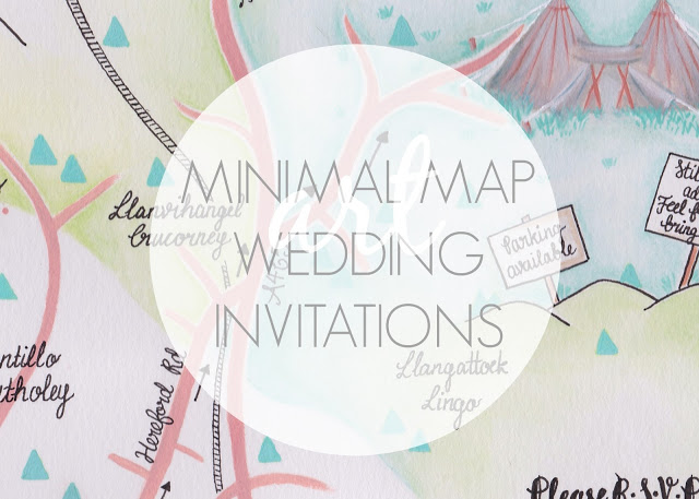
If you follow this blog, you might remember that back in April 2015, I was asked by a good friend of mine to paint an illustrated map for her wedding invites. After receiving the finished thing, and posting about it on here, another good friend of mine asked me to design and paint her entire wedding invite. I was so privileged to be asked, but it was one of those things that felt so important that I was completely terrified of messing it up. I was so terrified in fact, that it took me quite some time to actually sit down and start it. After some time though, when it really hit home that it wasn't going to paint itself, I did sit down and start painting, and just a few days ago, I received the final invite in the post.
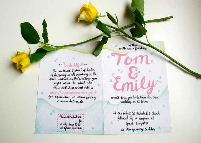
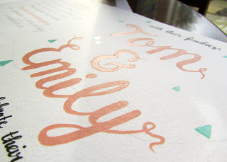
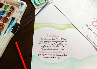
To start, I created some quick sketches based on my friend's brief and started to play with some colours. Once I was happy with the layout (several attempts later!) and I had a good idea of what I wanted to do and where, I measured and marked where the fold of the invite would be and sketched out my design onto two pieces of A4 sized cartridge paper (i.e. one piece for the inside of the invite and one piece for the front and back). On the first draft I used a pencil for this, however after painting I found it really hard to remove the pencil marks and so several experiments later, I swapped over to very lightly sketching everything out with watercolour pencils. This meant that when I started painting, the watercolour pencil marks just dissolved into the watercolour paint.
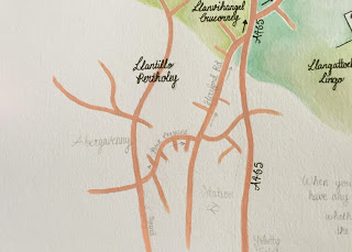
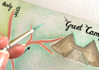
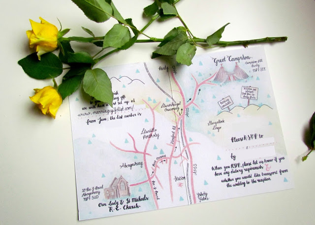
In some areas I used both watercolour paints and acrylic paint and at times even mixed the two together. This gave some parts of the illustration, such as the roads, trees and buildings, a vibrancy and dimension of depth that I didn't feel I could achieve with watercolours. Inspired by the Norffo Watercolour Font, I then hand lettered all of the details onto the invitation using a variety of black fine liners.
When I was finally finished, I scanned both pieces into the computer and emailed them to my friend. Thankfully all my initial worry was all over nothing as my friend assured me that her and her fiance were thrilled with them. It was so great to see all my hard work come together and I really loved the colours and quality of the printed invites.
My partner keeps telling me (if I ever have the time...) I should aim to sell hand painted wedding invites in the future but my inner perfectionist keeps making me question if my paintings and illustrations are actually any good - it's so hard to judge your own work!
What do you think?
Let me know in the comments below!
♥
